Published February 23rd, 2024 - updated December 9th, 2024

This week the ORR released their "origin-destination matrix" (ODM) for the year to March 2023. This provides an estimate of the number of rail journeys between every two station pairs on the whole rail network. This is generally regarded as the first proper post-Covid baseline.
They have previously published the data from 2018 onwards, so in theory this allows us to do a comparison of before and after Covid.
However, comparing the data numerically is tricky. There have been changes to the methodology for attributing journeys to London stations, the Elizabeth Line opening, and significant up-take of 'split ticketing.'
Comparing the data at a station level masks various trends: the total number of journeys at a given station might be similar, but that might mask an increase in long distance and a decrease in local journeys. Many changes to "most popular routes" were actually more about split ticketing, than changes in demand.
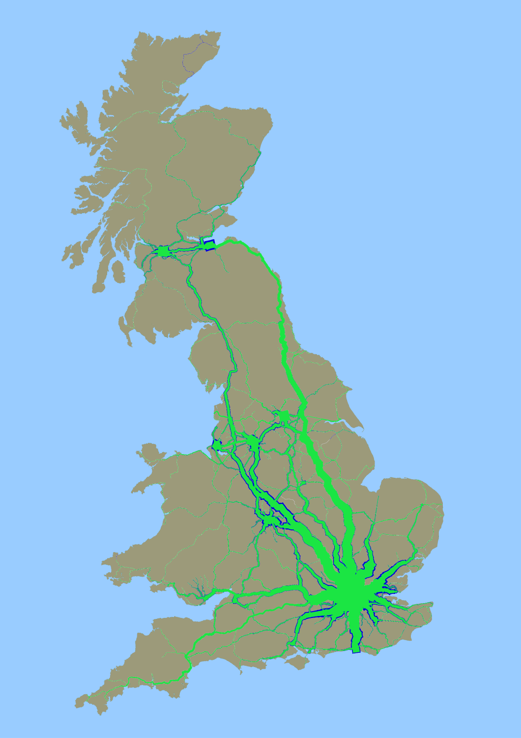
We needed a different way to visualise the data. Fortunately, Will Deakin has been spending some of his spare time mixing the ODM data with the "centre-line track-model" to create a map of Great Britain where the line thickness represents the number of journeys (you can read more about that here). As this plots the demand where it falls, it isn't impacted by split ticketing, and isn't hugely upset by the changing weighting between London Terminals, or the remapping of services between Manchester Piccadilly and Manchester Victoria.
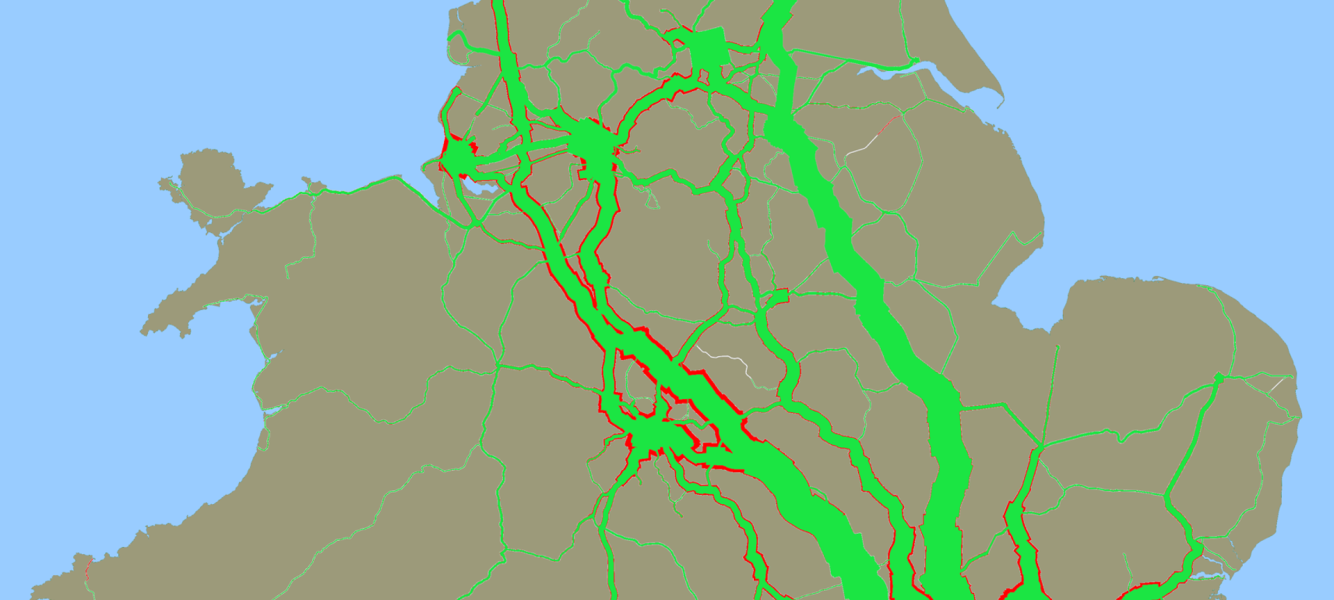
So last night the computer cogs were set in motion to churn away and produce the 2022-2023 usage map (shown in green). I've taken that and overlaid it on the 2018-19 usage map (shown in blue). Anywhere where you can see blue are journeys from 2018-19 that have not returned in 2022-23. It shows an interesting regional picture: I was vaguely aware the East Coast Mainline had fully recovered, but the West Coast Mainline was still lagging - but some of the other differences were a bit of an eye opener.
High resolution version of the map to download here

Update December 2024:
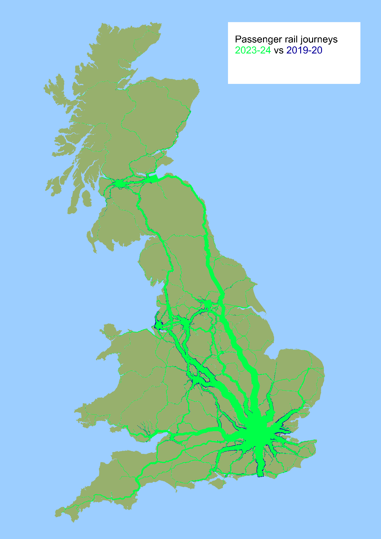
The data for 2023-2024 is now published, so we can see an updated map of 2023-24 vs 2019-20, showing where demand hasn't fully recovered:
High resolution version of map available to download here

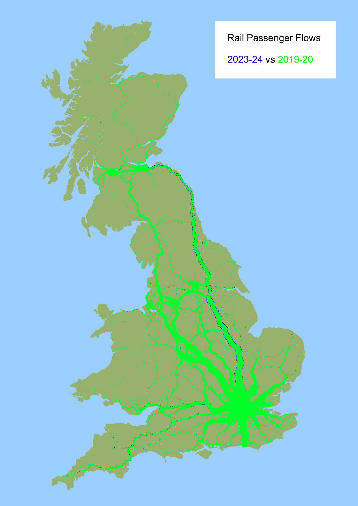
And we can also reverse the data, to see where passenger journeys now exceed pre-Covid volumes:
High resolution version of map available to download here

Credit to Will Deakin for his work on the maps, and credit to the Rail Data Marketplace team at Rail Delivery Group who took the request for these datasets to be published, and made it happen.